Got Milk, Too?

Got Milk, Too?
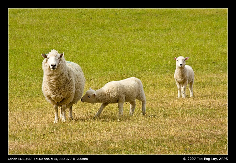
A companion to my first “lamb post”… 😛 I was lucky to catch yet another baby lamb looking for a drink of milk, this time at a closer distance, and with another baby lamb looking on too!

If you’ve followed my earlier rant about Adobe Lightroom’s handling of colours (take a look at Lightroom’s version of the above picture), here’s what I found on Adobe’s forums. Seems like the decision to switch back to Canon’s Digital Photo Professional (DPP) is the right one to take for now. Actually, DPP has improved with newer versions, kudos to Canon. The newest one I’m using (version 3.2) even include lens aberration correction for at least 2 out of the 3 most common lenses I use). Liking the results I got (having gotten used to and overcoming DPP’s poorer interface), I have replaced some of my recent NZ posts with DPP-rendered versions instead. So do take a look at these posts again if you found their colours lackluster recently. Hopefully, you might end up as pleasantly surprised as I am 🙂

Good Morning Lake Tekapo

Good Morning Lake Tekapo
Coming up with names for all of my New Zealand pictures are not easy, not when there were so many different pictures (with similar subject but yet different refreshing angles) to take at each spot we arrived at! The above is another shot I caught at Lake Tekapo. This was taken some time after dad took “Russell Lupins Bloom At Lake Tekapo”. Note the change in lighting… For my shot, I’ve decided to use a wider angle to catch the side-lighting over the blooming Russell Lupins.

A Colourful Morning

A Colourful Morning
Back to the New Zealand images for a change… I caught the rainbow outside Alpine Cottage, our 5-star motel at Lake Tekapo, a couple of minutes after dad took his shots. The skies were brightening rapidly and we wished we could have gotten up even earlier. Nevertheless, the early morning outing was a fruitful one and we managed to return of a haul of good pictures 🙂

I am in a midst of a RAW workflow dilemma: while Adobe Lightroom offers more control with a slick, easy-to-use interface as well as a smoother workflow compared to the software supplied with my 40D (Canon Digital Photo Professional), I am somewhat drawn to the excellent colour rendition DPP generates. I prefer the tones and brighter colours that Canon DPP seem to be able to pull out readily compared to Lightroom. This is despite loading Lightroom with several calibration presets for the 40D which I have found on the web. So frustrated with Lightroom’s colour rendering that I have decided to reprocess several of the keepers from my NZ trip completely with Canon DPP. I hope to post up the results for a comparison soon… Meanwhile here’s the same shot as above, but processed with Lightroom for a comparison.